 This image has a ,lot of implied motions like in Ch. 11, the different Karate movements in this Japanese art work shows different moves that would be considered implied movement. Very interesting.
Tuesday, May 3, 2011
Friday, April 22, 2011 - Implied Motion
This image has a ,lot of implied motions like in Ch. 11, the different Karate movements in this Japanese art work shows different moves that would be considered implied movement. Very interesting.
Friday, April 15, 2011 - Emphasis and Focal point

This image represents the idea of a focal point which is in the center of the circle/flower, the buds represent the outer layers.

The image next to me, is an emphasis idea being portrayed through the red X's.
Wednesday, April 13, 2011 - Group

Even though we did not do this project I really wanted to do the squirell in the tree idea. We could of made the squirrel out of a wire and filled him with leaves and sticks and bamboo to recreate him/her in their natural habitat.
Friday, April 8, 2011 - Emotive Lines

This picture/poster is something I made with my fraternity for our Bid day, where we try and get new members through rush events. This picture has many different emotive lines, the water and sky division is an implied line, no actual line is drawn, but it shows a vastness and serene sense of the huge ocean. While the fishing line is soft and steady in the ocean's vastness.
Wednesday, April 6, 2011 - Lines

 In this image a Psychic Line is being portrayed, I am looking at my sister causing a line to be formed from my eyes to the side of her head, but her distressed line is going straight into the camera or viewer, so two lines, not crossing are being developed here.
This line type is that of both implied and actual lines, the Fortune cookie paper has a curved line and the shadow forms an implied line is formed by the shadow of the actual line.
Wednesday, March 30, 2011 - Faith Ringold

Title: The Flag Is Bleeding #2
Artist: Faith Ringgold
Year: 1997
This painting depicts a bleeding flag and a mother bleeding from the breasts as her children cling to her. I think this image is disturbing and beatiful at the same time. The opression that people of different races and cultures, especially the women, is still present even in African Americans, who have been free'd from slavery since 1860's and Civil Rights has been over since the 1970's, but this artist and many other people still see that unity between the races and cultures can come a lot further, this piece shows the trials and tribulations of a black mother, we do not know her story, but we feel for her as she stands behind our countries esteemed flag, which is fetchingly bleeding with her.
Friday, March 25, 2011 - Value
 This image is a gradient with three similar circular objects, one in the lightest part of the gradient (center) one in the darkets (top right) and one in the medium color (bottom left). Now all of these are the same exact circles and though they look different against the background it is easier to see they are similar if you do not understand the concept of a gradient and how it has hundreds of different shades that lightly change over the picture to give a sense of glare or lightening as if a room.
Wednesday, March 23, 2011 - Music Video

Muse: Feeling Good
This music video which features, Muse, a British Rock band, is not my favorite of them, I previously did MK Ultra for my sound project and that would be one of their better songs. But this song has the visuals that not many other videos they have done can be related to. This uses roses and instruments and even the singers hair to convey a red color and tone, which goes well with the song, being that red is the color of joy, and lust. And Feeling Good is all about "Feeling Good" whether it be through the company of women (lust) or joyous occasions that you can let go of reality from. Visually this video is one of their best and has a blues feel to the rhythm.
Friday, March 18, 2011 - Money as Art
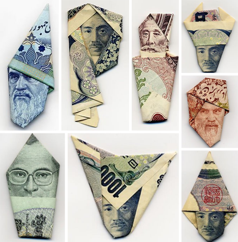 I love these images! They take a lighter side to the dictators and leaders that each money portrays. The top left is my favorite, it makes the Arabic leader look like Dumbledore off of Harry Potter and shows a fun way to make agronomic art with the faces on money. We used to make bow ties out of five, tens, and twenties, the ones did not work so well, the face is suppose to show up in the middle and this section of that article reminds me of this. Very interesting.
Wednesday, March 16, 2011 - A - R - T
 Had to convert this to a jpeg because my computer at home does not have illustrator. The letters slightly overlap but the red and black show up as a continuous image.
Friday, March 4, 2011 - Synethesia

I completed my sound project for the in-class assignment using Scott Pilgrim (the movie, 2010) and the band Muse (song: Mk Ultra) as inspiration, so whenever I think of sound in art or imagery I think of this movie or movies/images like it. This one is particularly cool becuase it is not from musically inspired sound images, but instead a split second punching sound "Kroww" and the sound wave that it creates as it causes the antagonist to go flying.
Wednesday, March 2, 2011 - Money Design

This currency from North Korea. It is much more simple and epic that that of American, Euro, or even other Asian currency, I think this is because of the strict control over the currency that the residing government has over the distribution of money, Counterfeiting money in America is a jail sentence, counterfitting in North Korea could be much worse of a punishment, Also the three soldiers at the bottom look like Air Force, Navy, and Army, like as if they are saying Air, Sea, and Ground (respectively) military are so important that they put them on their money. This is a very interesting currency that has so much culture and history behind it.
Friday, February 25, 2011 - The Grid

 This is an example of a Tight Grid painting that is said to resemble a Chuck Close painting with its intricate pieces and different shades.
At first I thought it was a tile floor that was just a photograph of it, little did I know that it was an actual painting made to look like tile, very intricate.
By: Mark Lawrence
Title: Tile Art #11
Date: 2007
This is an example of a loose grid, it is not uniformed or "tight" and looks like confetti, but the house in the center is depicted and easily seen.
By: Jennifer Bartlett
Title: House Dot and Hatches
Date: 1999
Wednesday, February 23, 2011 - Chuck Close

This painting is by Chuck Close, I enjoy the honesty of the paining, the image is not something that was meant for an ad or to be seen as attractive, but it is real. This man, 'Mark', is considered to be a painting of the photorealism genre, which by definition is repainting a photograph with paint or airbrush and usually blown up, it was done before 1972, as apparent by the wardrobe. I love the realistic and honest nature of the painting, it isnt glamorized by the media and has a sense of authenticity to it that is hard to replicate.
Friday, February 18, 2011 - repetition of form
 This image is a brand called Nesta, which is a clothing company for skater clothes, I used to wear this a lot as a young teen. I like the repetition of the lions mane and Gestalt principles of continuity used here. The brand logo at the Bottom, an I encased by a circle is subtle as it is in the same form as the lion's face and mane, but stands out at the bottom as breaking the mold.
Wednesday, February 16, 2011 - Gestalt 2

This blog post is an image that I took with my camera that shows the Gestalt principle of an Anomaly. The Black Lab, Daisy, in the corner is a contrast to the large lake and freshly cut grass of the bank. The complex figure of the dog is a sharp contrast to the flowing water and greenery of the bank that makes the eye gravitate towards the dog even though it is not in focus or the center focal point.
Friday, February 11, 2011 - Andy Goldsworthy

Andy Goldsworthy makes art out of nature, and I am not the artist in my family, my sister is, so I asked her for help on this one. She said just look at her facebook and computer photos, she was right, I really like this one that she took, it is the peace sign made out of flowers on a stone marble floor that says 'imagine' which i am sure is meant to signify John Lennon's death and life. I am not sure if she made this herself or found it in New York at a John Lennon memmorial, She likes to travel a lot. But I take a lot of inspiration from her and love looking at and helping her create art in many different mediums.
Friday, February 11, 2011
Wednesday, February 9, 2011 - Gestalt Unity

This image represents the law of continuity using Gestalt principles, it shows the white box in the middle that even though not completed by lines, your minds eye draws the rest of the box with the law of continuity. I like this image in the fact that it has pac-man like characters on the edge which are quarter circles and two lines in the middle that give the whole image a sense of symmetry.
Friday, February 04, 2011 - Louise Nevelson's Box
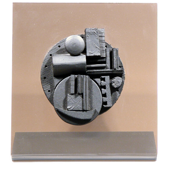
This box by Louise Nevelson is rustic looking and has unity in its circular shapes but shows contrast with the few rectangular shapes and wooden exterior. I like this Box for its simplicity and wooden rustic feel, The circular objects stay in the boxes frame but some of the rectangular objects go out side of the frame and give a nice contrast to the norm.
Wednesday, February 02, 2011 -Lucas Samara's Box
 This is Lucas Samara Box #53, and it was made in 1966, I like that Lucas Samara uses mixed media to create his boxes, the description on this box is less than lacking, they do not really tell how it was made or even if the birds are stuffed or made from scratch. I do like the imagery though, it seems like the birds are very diverse, I see a cardinal, humming bird, and many other different types of birds, making this a diversity picture for birds, all sharing the same box. But that is just my interpretation.
Monday, January 31, 2011
Friday, January 28, 2011 - Joseph Cornell
 I like this Cornell Box the best out of all the ones I have seen because it is cluttered and semi random when you first glance at it, it seems rustic and ancient with the stoic statue at the bottom, and the images in the center, the focal points, look like astronomy constellations and are a good contrast to the ancient theme around them.
Wednesday, January 26, 2011
Wednesday, January 26, 2011 - Form and Content
Form and Content

This image is one of those sunday newspaper cartoons, but it has strong form and content in the drawing. It makes light of the fact that the Chinese government controls many parts of the social interactions and views that their citizens have, and even worse (not pictured) are North Korea's censorship, So this image, with its content, is very powerful and risky. Though I doubt China will take much offense to a newspaper cartoon, funny.

This image seems like a playboy spread or some kind of image found in a Men's Magazine, has the form of previously mentioned, but the content is that of a PETA advertisement, showing that people (humans) have the same parts as animals and we're "not that different, after all" or whatever PETA is trying to protest this week. The "Going Vegetarian" is not really my thing, but anyone on the fence about this issue might be persuaded by this image, which is a little more risque and funny, than most activist images, and might win a different markets interests, with being less intrusive and more laid back.
Friday, January 21, 2011
Friday, January 21, 2011 - Definition of Design
Definition of Design
"Design as a noun informally refers to a plan for the construction of an object (as in architectural blueprints, circuit diagrams and sewing patterns) while “to design” (verb) refers to making this plan.[1] No generally-accepted definition of “design” exists,[2] and the term has different connotations in different fields (see design disciplines below). However, one can also design by directly constructing an object (as in pottery, cowboy coding and graphic design).
More formally, design has been defined as follows.
- (noun) a specification of an object, manifested by an agent, intended to accomplish goals, in a particular environment, using a set of primitive components, satisfying a set ofrequirements, subject to constraints;
- (verb, transitive) to create a design, in an environment (where the designer operates)[3]
source: Wikipedia"

I Think this energy drink ad is a good example of design in our modern day world. Now a days the only types of long lasting, independent (non-government funded) designs have to make money for someone, it may be a collectible or be able to reach millions of people and inspire them to ____ (blank is for whatever you want your "consumer" to do, versatile right?). The definitions of design are varied and usually have a bias towards whichever discipline the author has taken up as his perspective. But in today's capitalist mindset, and today's youth being very connected with Facebook, Twitter, and internet access virtually everywhere, The designers of today need to be innovative and original, or it just will not reach their desired masses.
This image was found on a blog site, where an Advertising graphic designer made (and quickly I might add) a generic energy drink advertisement in photoshop. It does not have a name on the image, as you can see, and just the basic color scheme and form have that "energy" feel to it. You may see this image in the near future with any kind of current energy drink thrown into the mix, and that is when this image will really be seen, only when sponsored by a corporation and endorsed, will this image ever be seen by a very large audience, but at what cost?
Wednesday, January 19, 2011 - Types of Design
1. Interior Design
This type of design "is a multi–faceted profession in which creative and technical solutions are applied within a structure to achieve a built interior environment".
I think this type of design is innovative and constantly dynamic, always changing with culture and trends. This means that a design made in the 70's would not be as aesthetically pleasing today as it was back then.

![]()
2. Computer Engineering
Computer Engineering is "is a discipline that integrates several fields of electrical engineering and computer science required to develop computer systems."
I Think this type of design/development field is almost the exact opposite to my first example. Computer Engineering is very technical and though there is not one way to do anything in any kind of design, this has specific knowledge and specifications that have to be met and understood to be able to design a system, unlike interior design, where any person can give their own perspective and bias to create a totally different design.
3. Advertising and Marketing
Advertising and Marketing are "is a form of communication intended to persuade an audience (viewers, readers or listeners) to purchase or take some action upon products, ideas, or services. It includes the name of a product or service and how that product or service could benefit the consumer, to persuade a target market to purchase or to consume that particular brand".
I have my own personal bias towards this type of design, this class, using photoshop and other computer programs to generate graphics and images will help with advertising, but that is just form and method, the content and style are all up to the Marketers and Graphic Designers, This picture is from a video game, Burnout, and was only placed in the video game during the election period and only in swing states, anyone in Georgia would see a Coca Cola commercial, but any swing state had this image, and for good reason, it was relevant and was the advertisers target market. The ad is just the first step in the Marketing process. Figuring out who needs to see the image the most and how many times they need to see it before they get the idea and are persuaded, is the main idea of this type of design.

Subscribe to:
Comments (Atom)